An Easy, Clean and Simple Background Idea: Masking
Hello! Today, I want to show you a super easy way to make a clean and simple background for the focal point on your cards. You can also use whichever shape of steel die you have on hand. It’s always great to shop your stash!
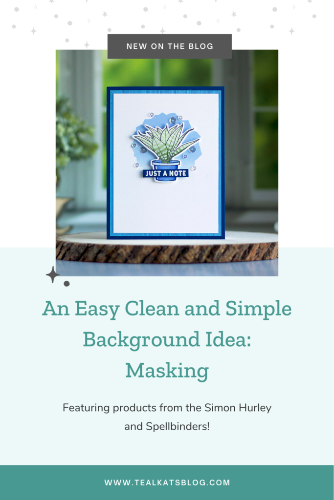
I really like making clean and simple cards. The white space just speaks to me, I guess! But, there is a limit to white space, depending on your design. You don’t want your focal point – in this case, my happy little succulent – to feel like it’s lost on the card front. So, an area of strategic ink blending helps to “ground” the potted plant.

The stamp set is Succulents by Simon Hurley, and luckily you can get the matching dies, too. It makes things so much easier than trying to fussy cut around stuff.
Speaking of the matching dies, you’ll notice that the shape I used for the ink blended area is slightly odd-shaped. That’s because I used one of the dies for the larger succulent images. The spiky edges match well, don’t you think?
So to make this card with its clean and simple background, I chose colors from one of my favorite nautical color schemes. First, I cut all the cardstock layers for the front panel: Whirlypop and Evening Surf are the two blues, and Neenah is the bright white.
Then, I used the white piece to create the succulent for the main focal point. For the pot, I used three Copic Sketch colors: B60, B63 and B66.
Luckily, there are fill stamps in the Succulent set, so you don’t have to color the plants. And that saves a ton of time! To get the gradient look, I inked the image with two colors of green ink; Catherine Pooler Eucalyptus and Matcha.
Pro tip: If you’re inking two colors on a single stamp, use the light ink first, so you don’t dirty up your lighter ink pads. Then tap your dark ink on gently to blend.

The little zigzag stripes are made with a Pentel MilkyPOP gel pen.
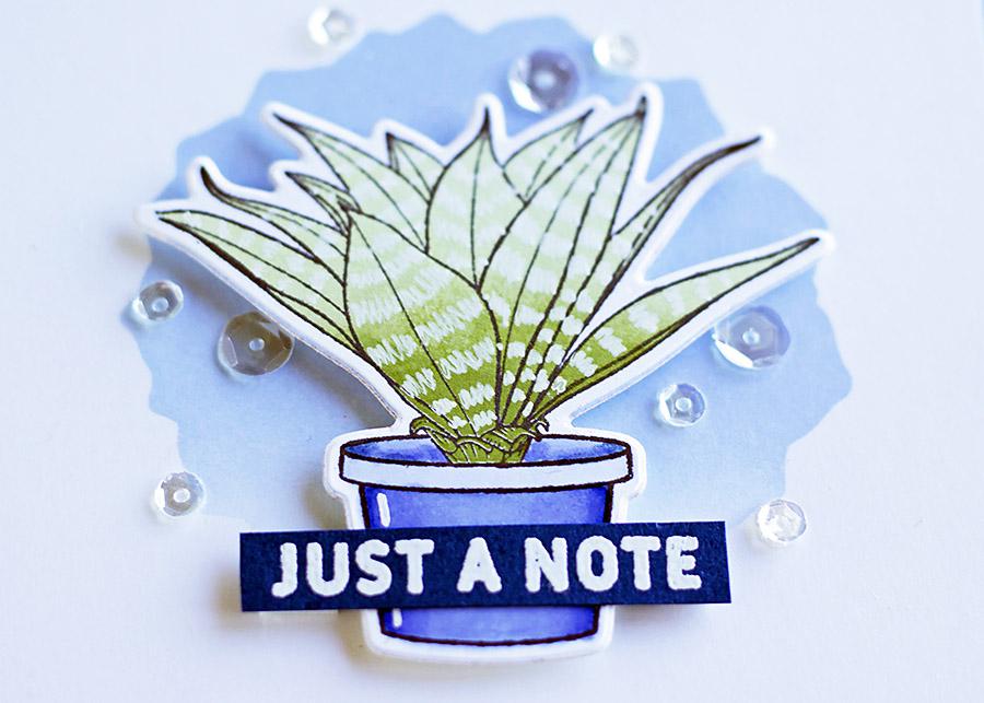
The next piece to make was the sentiment. I heat embossed it on a scrap of Whirlypop, then set aside all the pieces while creating the focal area for my clean, simple background.
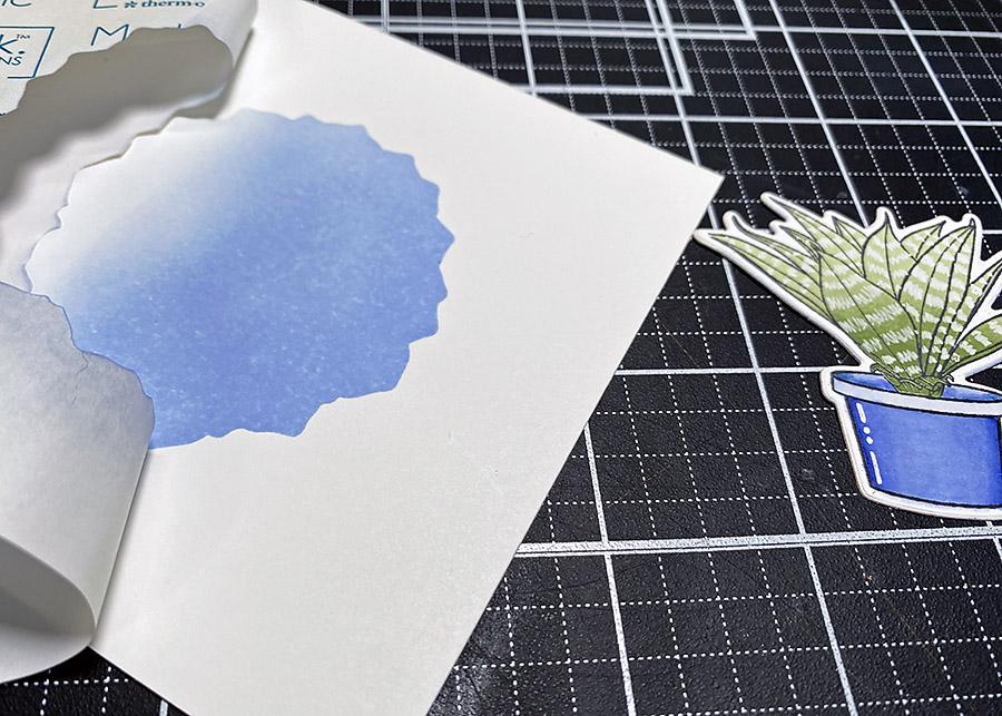
The die I chose to create the ink blended area is the largest one in the Succulents die set. I cut it from the center of a piece of Gina K Magic Masking paper. I made sure there was lots of room around the positive cut since I was going to use the negative to do the ink blending.
After I applied the masking paper to the white cardstock, I chose Dusty Blue Mid Tone Ink from Hero Arts for the blending. Starting with a blending brush and as heavily inked as possible at the top, I created a fade to white toward the bottom.
I love peeling off masking paper; It’s so much fun to see what’s underneath!
After the background spot dried completely, I affixed the plant with some 3D foam squares and layered the sentiment over the pot.
Of course, no card is complete without some decoration, right? At least, that’s how I feel about the cards I make. Although the design looked great even without embellishments, you know me. I can’t help myself. Must. Add. ALL. The. Sequins.

Thanks for reading today, lovelies. Remember this easy masking technique the next time you’re looking for an easy idea to ground your focal point while keeping a clean and simple background!
Photos: Canon Rebel T6i with 50mm lens, Replica Surfaces “Lush View” and “Shiplap”; Replica Surfaces Replica Studio, Assorted props and a window with great lighting!


Using ink blending brushes is even easier than using blending foam! Start by tapping your brush on your ink pad. It won’t look like there’s much ink on there, but there is. Always blend in circular motions. For edges, start your circles off the edge and slowly work your way onto the paper. For spot blending, dab your loaded ink blending brush on scratch paper, start at the center and build your color in a circular motion using very light pressure. 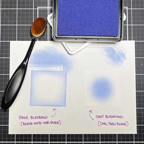
Water or dye based inks are best for ink blending. For example, Distress Inks and Distress Oxides, Hero Hues, or various other stamp company lines blend evenly on smooth cardstock. You can blend with pigment inks, like Versafine CLAIR, but they don’t dry quickly. So there’s a larger margin for error (and fingerprints!). Solvent inks, like StazOn, are best for stamping images and words.
Specialty ink like Versamark watermark ink or colored pigment ink is the best for heat embossing. This is because it takes longer to dry than dye based ink, thus allowing the embossing powder to stick to the stamped image. Try stamping in white pigment ink, then embossing with white embossing powder for perfect coverage and a super bright white look!